Richard rutter, nathan ford and amrinder sandhu, among others, have written extensively about extending the number of fonts available to web designers. The basic font stacks are based on a lowest common denominator approach, selecting only those fonts common to all computers. There are however, a significant number of fonts installed on a large percentage of computers which could be added to the basic stacks. This would allow those users with the fonts installed to view pages set in those fonts, while degrading to the basic stacks for those users who do not. In the example below, Garamond has been added to the front of the serif font stack. Users with Garamond installed will now have their page set in Garamond while those that don't will see Georgia.
{font-family:Garamond, Georgia, Times, serif;}
In this way it is possible to extend the basic font stacks significantly. As well as increasing the availability of typefaces this approach also facilitates other operating systems such as Linux which have a different set of fonts installed. The tables below give a good indication of current font availability.
Richard Rutter has devised a font matrix which is a useful tool in determining font availability across Windows and Mac operating systems. The matrix dates from 2007, so the tables below should be more accurate.
Think about typefaces beyond the core web fonts.― Richard Rutter, skillswap '09
Most common fonts on Windows (Dec 2011)
| Serif | % | Sans-serif | % |
| Georgia | 99.48 | Verdana | 99.84 |
| Times New Roman | 99.69 | Tahoma | 99.95 |
| Palatino Linotype | 99.42 | Arial | 99.84 |
| Book Antiqua | 86.09 | Trebuchet MS | 99.74 |
| Garamond | 86.24 | Lucida Sans Unicode | 99.37 |
| Cambria | 54.51 | Franklin Gothic Medium | 97.87 |
| Constantia | 53.81 | Calibri | 54.76 |
| Goudy Old Style | 51.30 | Candara | 54.31 |
| Baskerville Old Face | 49.10 | Gill Sans MT | 51.74 |
| Bodoni MT | 47.89 | Segoe UI | 45.04 |
Most common fonts on Mac (Dec 2011)
| Serif | % | Sans-serif | % |
| Times | 99.37 | Helvetica | 100 |
| Georgia | 97.63 | Geneva | 98.84 |
| Times New Roman | 97.63 | Lucida Grande | 100 |
| Hoefler Text | 88.70 | Arial | 98.73 |
| Baskerville | 88.60 | Verdana | 99.05 |
| Didot | 87.72 | Helvetica Neue | 98.58 |
| Big Caslon | 85.10 | Trebuchet MS | 94.2 |
| Palatino | 79.71 | Gill Sans | 91.52 |
| Lucida Bright | 99.68 | Futura | 91.01 |
| Garamond | 23.84 | Optima | 90.14 |
Most common fonts on linux (Dec 2011)
| Serif | % | Sans-serif | % |
| Century Schoolbook | 99.28 | URW Gothic L | 99.28 |
| URW Bookman L | 98.81 | Nimbus Sans L | 98.57 |
| URW Palladio L | 98.57 | Deja Vu Sans | 97.37 |
| Nimbus Roman | 98.33 | Deja Vu Sans Light | 94.94 |
| Deja Vu Serif | 97.37 | Deja Vu Sans Condensed | 91.17 |
| Bitstream Charter | 92.36 | Free Sans | 84.01 |
Source: Codestyle font survey
Nathan Ford has a detailed examination of improved font stacks grouped by serif / sans-serif / monospaced and by individual typeface characteristics, such as x-height and narrow face or condensed. He further breaks down the font stacks into suitability for paragraphs and titles.
The list below is a selection of his paragraph choices.
Serif
Baskerville, Times, “Times New Roman”, serif
Garamond, “Hoefler Text”, Palatino, “Palatino Linotype”, serif
Georgia, Palatino,” Palatino Linotype”, Times, “Times New Roman”, serif
Cambria, Georgia, Times, “Times New Roman”, serif
“Copperplate Light”, “Copperplate Gothic Light”, serif
Georgia, Times, “Times New Roman”, serif
Palatino, “Palatino Linotype”, Georgia, Times, “Times New Roman”, serif
Palatino, “Palatino Linotype”, “Hoefler Text”, Times, “Times New Roman”, serif
Times, “Times New Roman”, Georgia, serif
Sans-serif
Geneva, “Lucida Sans”, “Lucida Grande”, “Lucida Sans Unicode”, Verdana, sans-serif
Arial, “Helvetica Neue”, Helvetica, sans-serif
“Century Gothic”, “Apple Gothic”, sans-serif
“Franklin Gothic Medium”, “Arial Narrow Bold”, Arial, sans-serif
Futura, “Century Gothic”, AppleGothic, sans-serif
“Gill Sans”, Calibri, “Trebuchet MS”, sans-serif
“Helvetica Neue”, Arial, Helvetica, sans-serif
Impact, Haettenschweiler, “Arial Narrow Bold”, sans-serif
“Lucida Sans”, “Lucida Grande”, “Lucida Sans Unicode”, sans-serif
Tahoma, Geneva, Verdana, sans-serif
“Trebuchet MS”, “Lucida Sans Unicode”, “Lucida Grande”, Arial, sans-serif
“Trebuchet MS”, Tahoma, Arial, sans-serif - t
Verdana, Geneva, Tahoma, sans-serif
Verdana, Tahoma, Geneva, sans-serif
Monospace
Consolas, “Lucida Console”, Monaco, monospace
“Courier New”, Courier, monospace
Printer fonts versus screen fonts
Many of the fonts listed above are digitised versions of printer fonts. While they will display reasonably well across the various systems, fonts designed for screen will be more legible. Typefaces designed specifically for screen are more open and serifs faces have less contrast between the thick and this strokes leading to improved legibility on-screen.
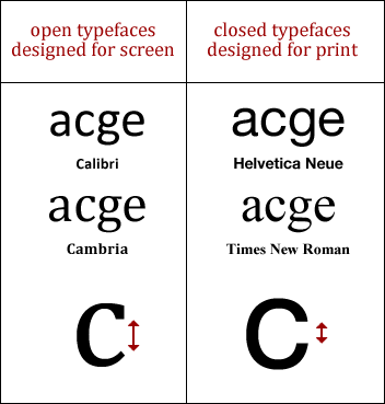
Cambria, Constantia and Georgia are common serif faces which have been designed specifically for use on-screen. Calibri, Verdana, Lucida (various), Tahoma and Trebuchet MS are the equivalent sans-serif faces. Consequently, this writer suggests the following font-stacks ―
Serif
Cambria, Georgia, Times, “Times New Roman”, serif
SAns-Serif
Calibri, "Lucida Grande", "Lucida Sans", Verdana, sans-serif
In Summary
Extended font stacks are a valuable addition to the core web fonts. With the font-stacks suggested, and according to the statistics above, 54.5% of Windows users will view a page using this font-stack page in Cambria, and all but 0.5% will view it in Georgia. Cambria is available on 40.82% of Macs and Georgia is available to 97.63%, leaving 2.3% defaulting to Times.
Extended font stacks can definitely improve the individual character of a website for a majority of users.